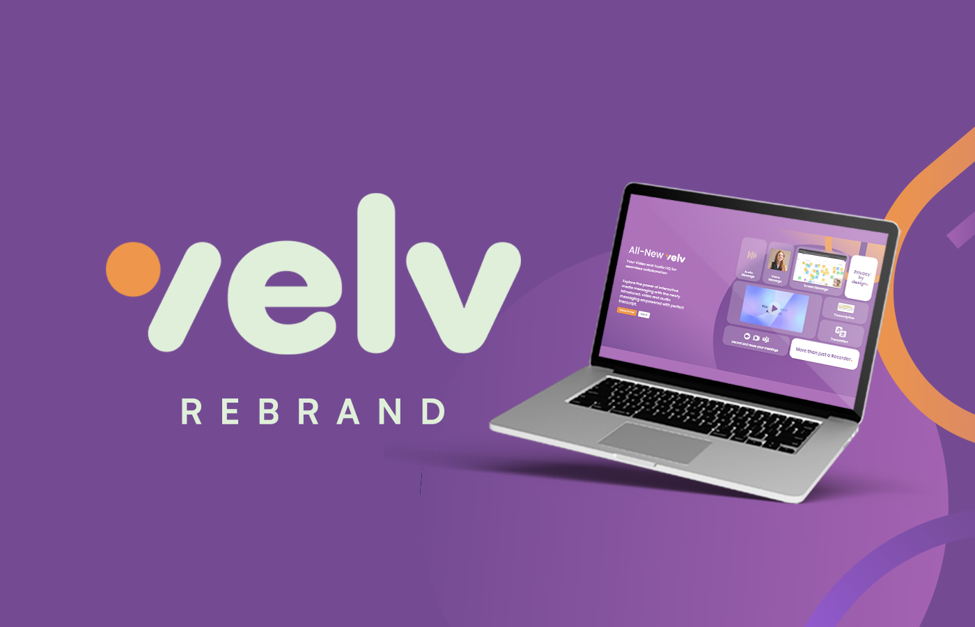
A product that had grown. A brand that hadn't kept up.
Identity before product. Brand before broadcast.Velv is a communication platform built for teams that want less noise and more signal. Video messages, audio messages, transcription, translation, reactions and meeting recordings — all in one place, built around the way people actually work.
The product had matured significantly. The brand hadn't. The visual identity needed to catch up with what the product had become — credible, modern, and built for a professional audience without feeling corporate or cold.
The brief was brand identity and a social content system. The output needed to work across the product interface, marketing assets, and social channels simultaneously.
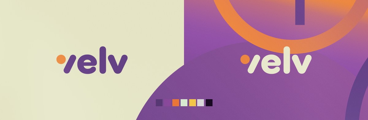
The identity system was built around a rounded, approachable wordmark anchored by an orange dot — a deliberate choice that gave Velv a visual personality distinct from the category's default blues and greys. Purple as the primary hue communicated creativity and intelligence without the sterility of enterprise software.
The colour palette extended across a range of accents — orange, mint, yellow, lavender — giving the system flexibility across dark and light backgrounds, social formats, and product UI contexts. Every choice was made to scale, not just to look good at launch.

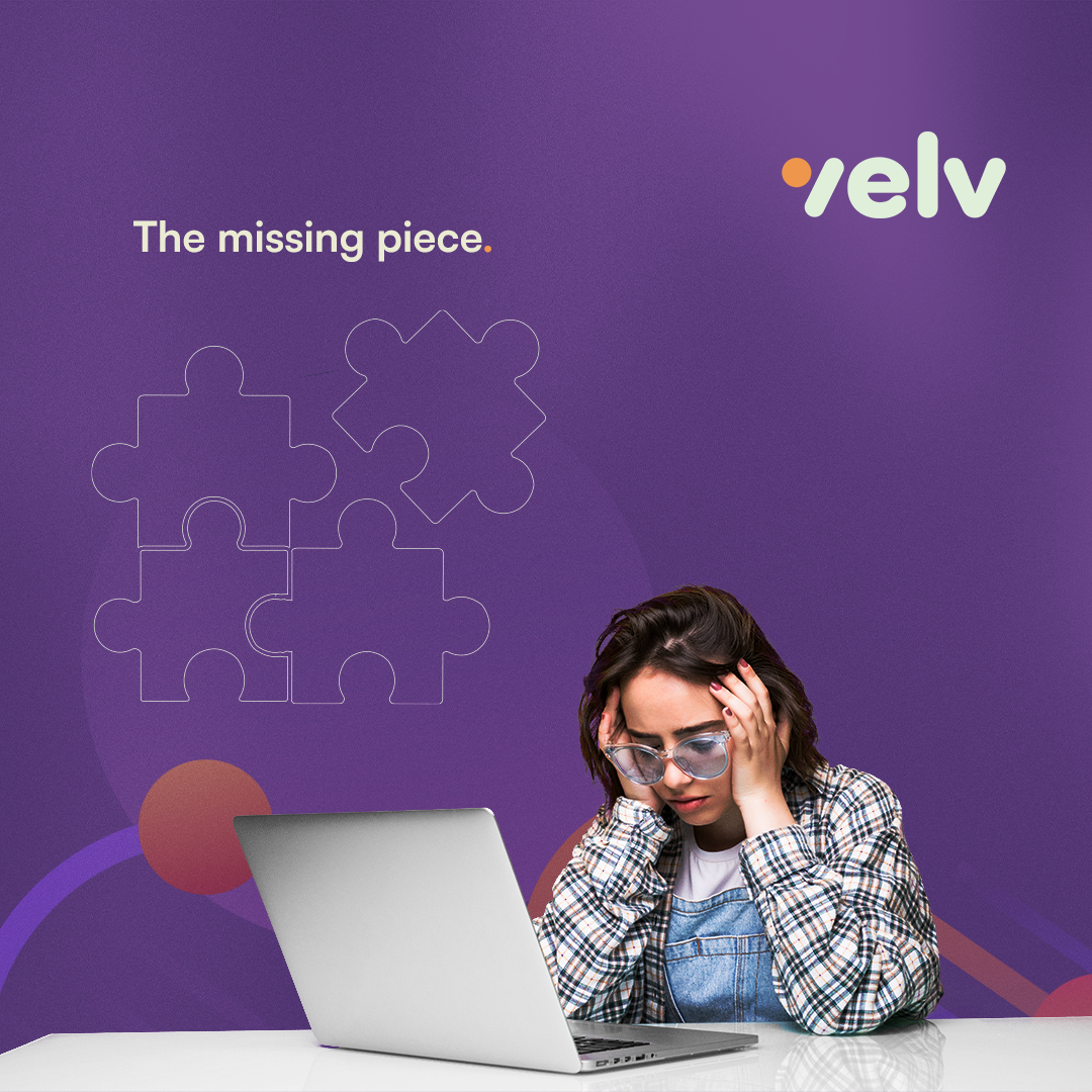
The social content strategy led with pain points, not features. Teams drowning in project confusion. Conversations that should have been messages. The missing piece in how remote teams communicate. Each post used the visual system to make the problem feel felt before Velv was offered as the answer.
The assets were built to be consistent without being repetitive — the same brand language across every post, executed through varied creative approaches.

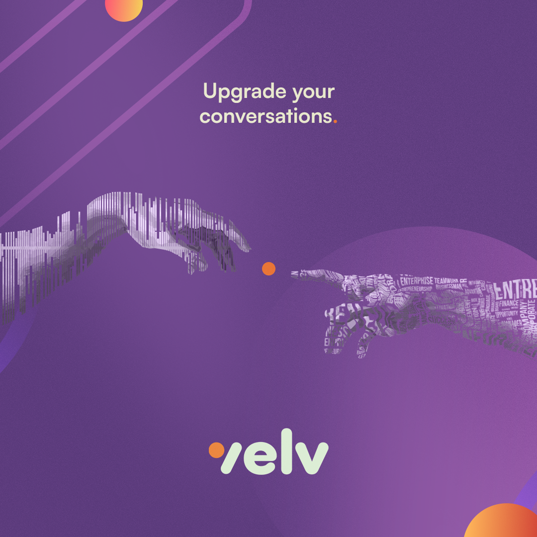
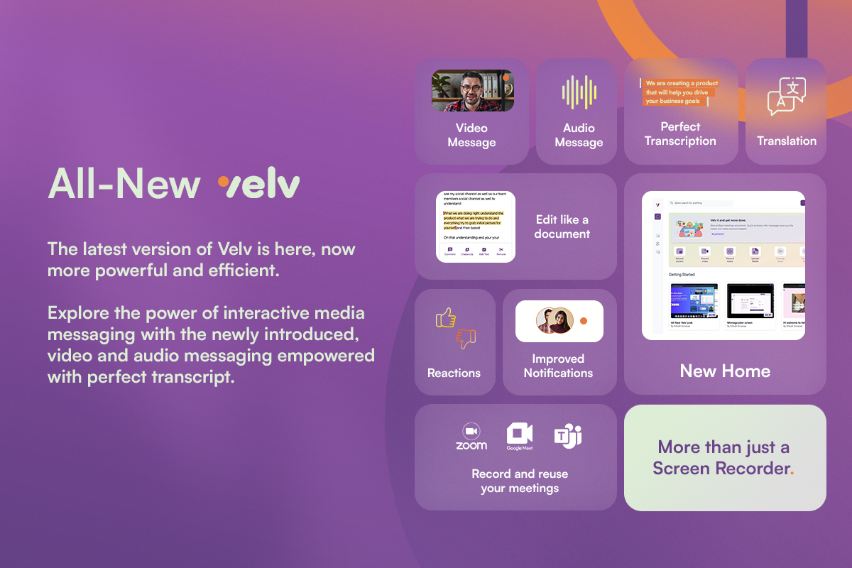
When Velv launched its updated product with video messaging, audio messaging, improved notifications, reactions, and meeting recording capabilities, the brand system was already in place to support it. The launch asset carried the full feature set clearly without losing the visual warmth of the identity.
The brand worked exactly as it was designed to — a system flexible enough to communicate product detail without becoming a spec sheet.