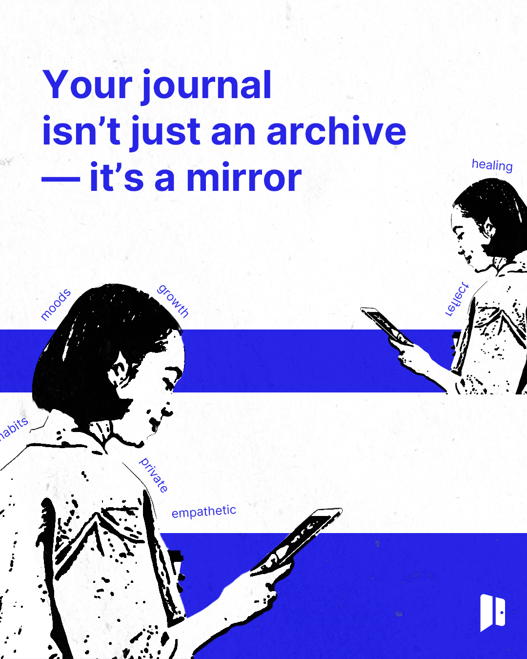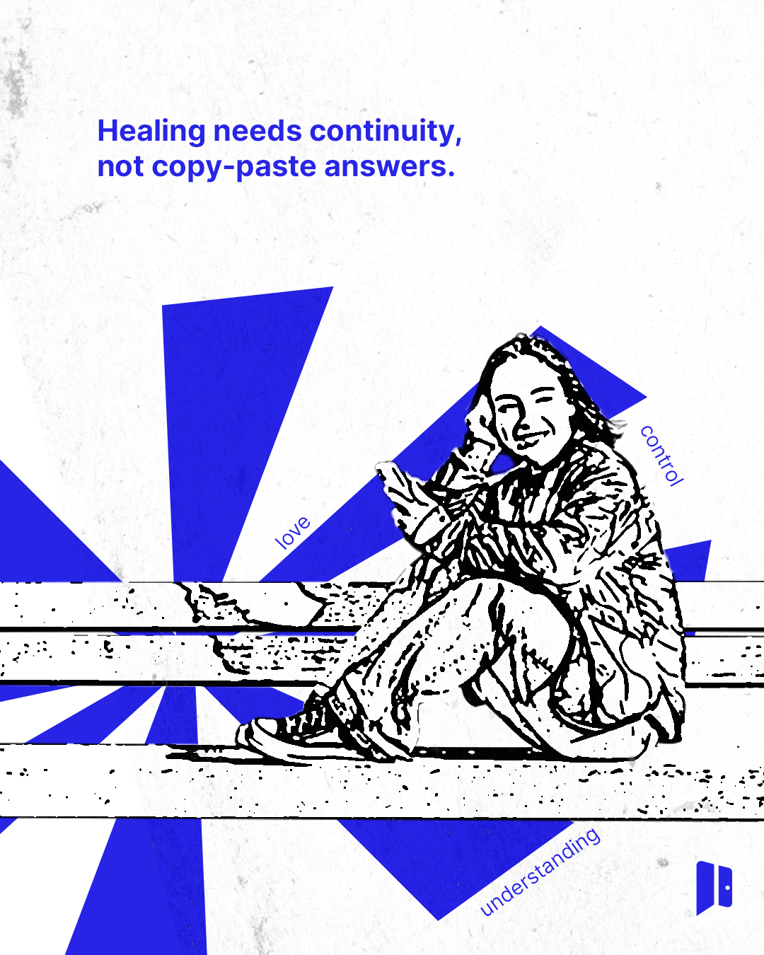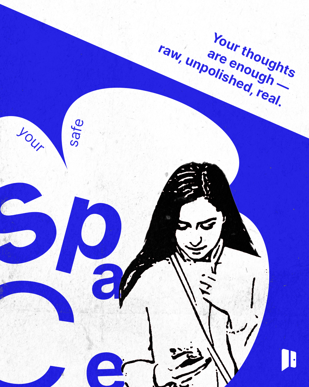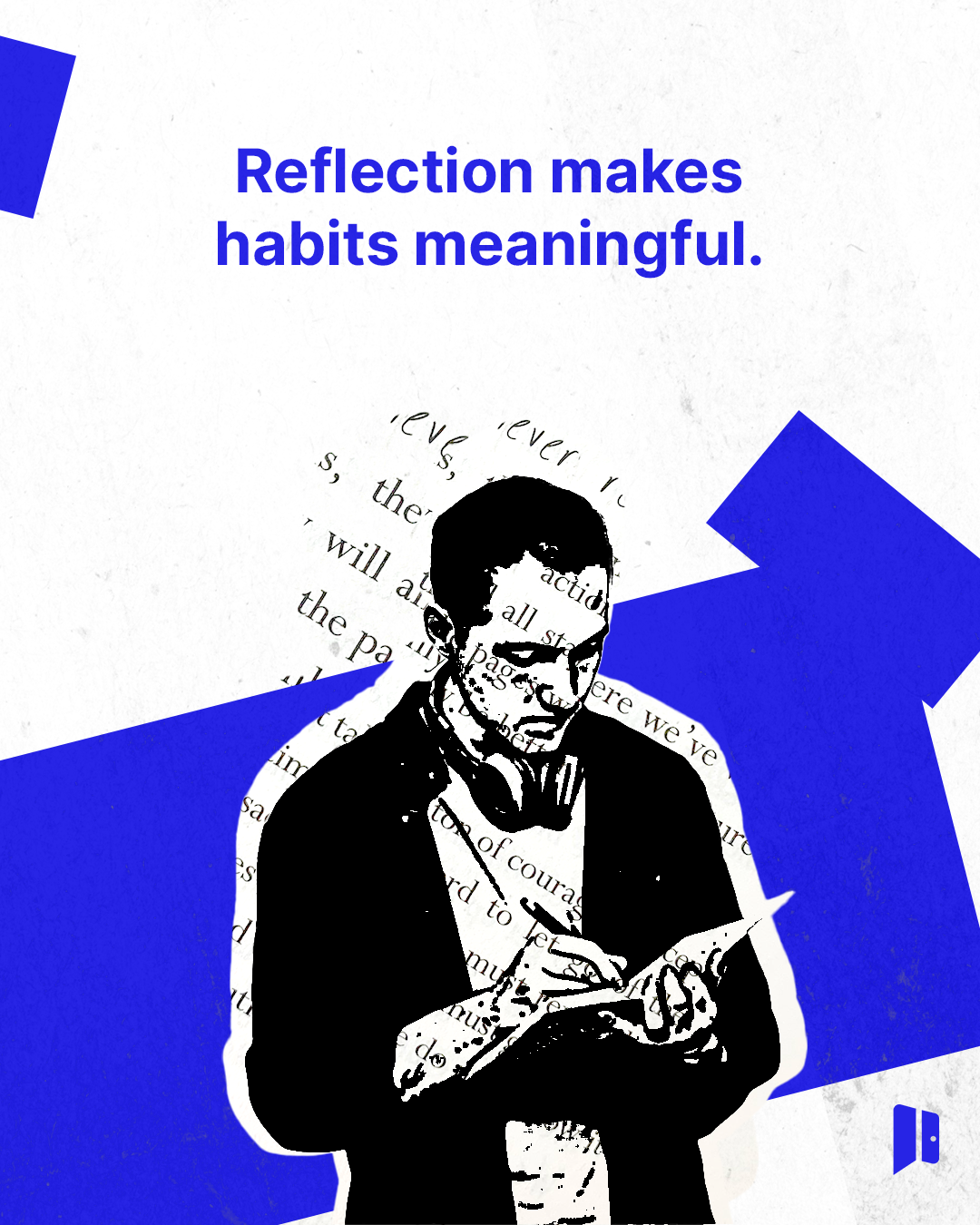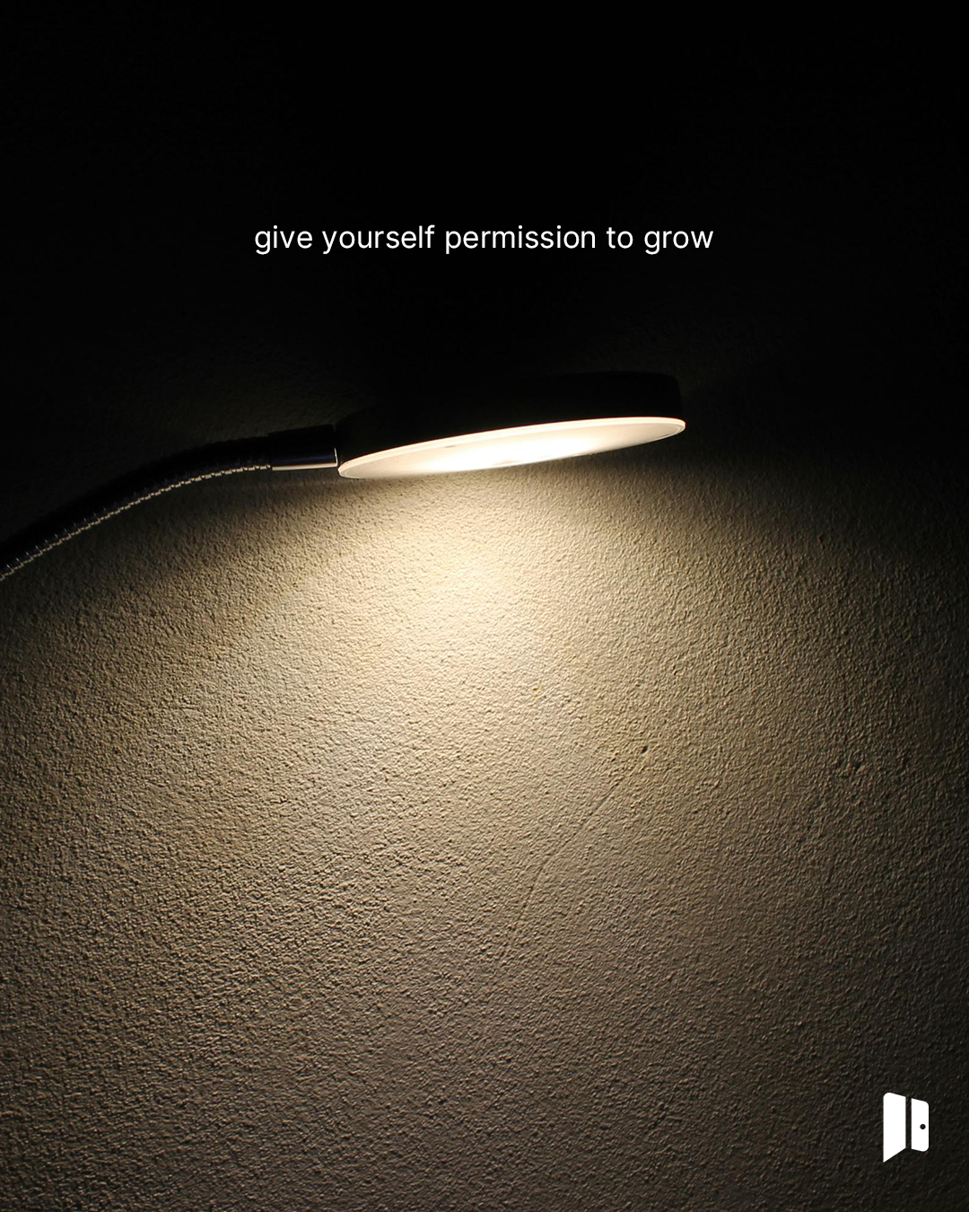
Mental wellness is a crowded space. Most brands in it are too loud. Shadoor needed to be different.
Voice before visual. Restraint as the strategy.Shadoor is a journalling app built around reflection, not performance. The brief was to build a brand that felt like a safe place to land — not another productivity tool dressed in wellness language.
Too many brands in this category default to urgency: fixing, optimising, pushing. Shadoor needed to resist that instinct entirely, and build something that felt like permission rather than pressure.

We started with voice before visual. Because for a brand like Shadoor, how it speaks matters more than how it looks.
The brand voice we built is gentle by design. Warm without being saccharine. Honest without being heavy. It speaks the way a good friend does — present, unhurried, without an agenda.
From that foundation, we developed the full messaging architecture: key messages, brand phrases, a language guide, and the tone principles that govern every word Shadoor puts into the world. Every piece of copy was built to make the reader feel one thing — understood.
The logo system followed the same principles. Calm. Minimal. Nothing competing for attention. A visual identity that steps back so the person using the app can step forward.


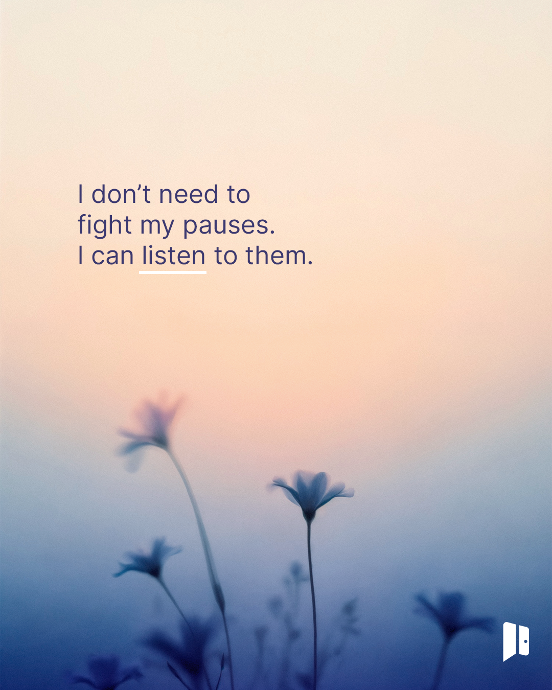
“Pause and notice.”
“You don't have to rush your healing.”
“Not every dark thought is a warning. Sometimes it's your mind asking to be heard.”
“Healing rarely looks tidy. Some days you move. Some days you rest. Both count.”
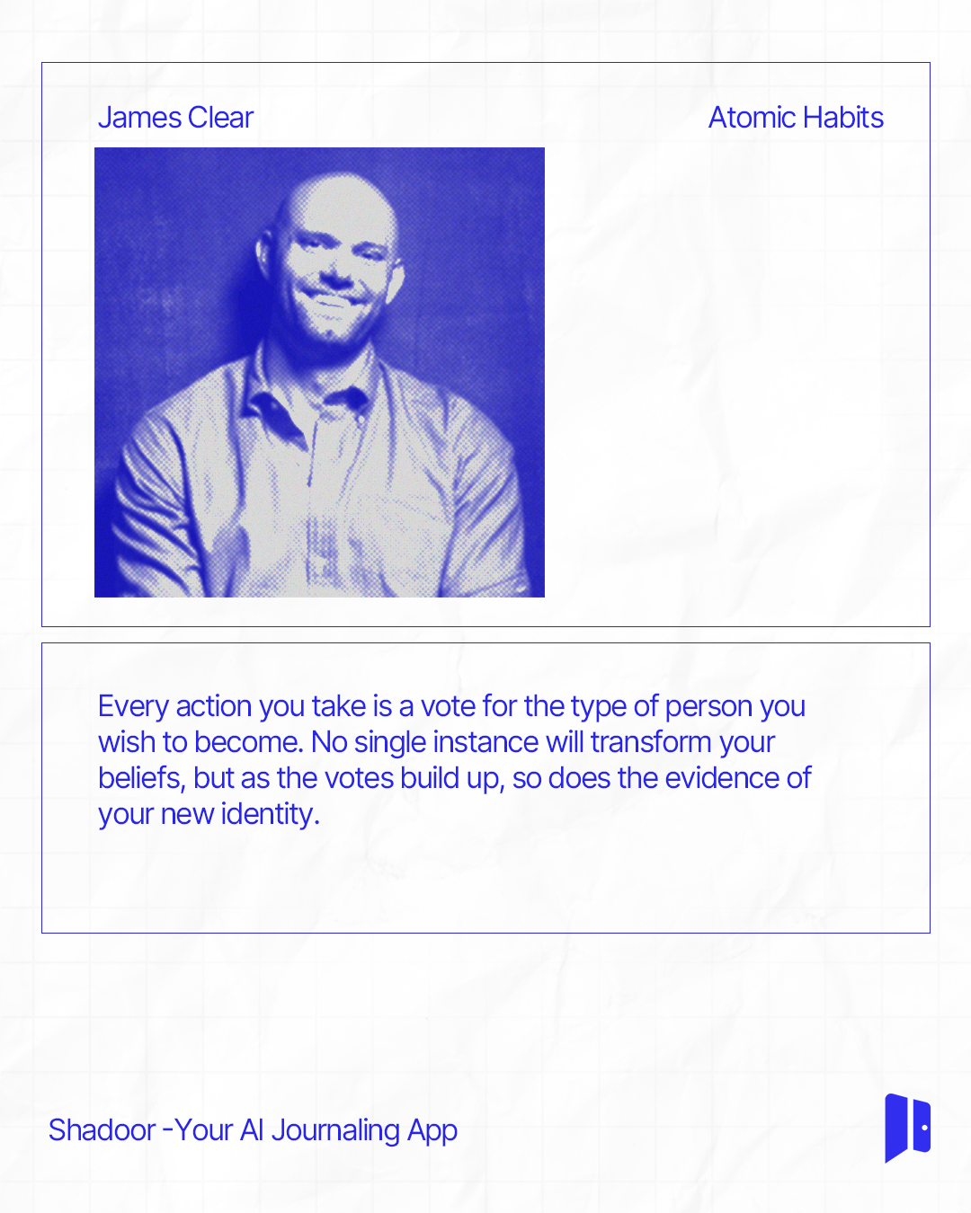
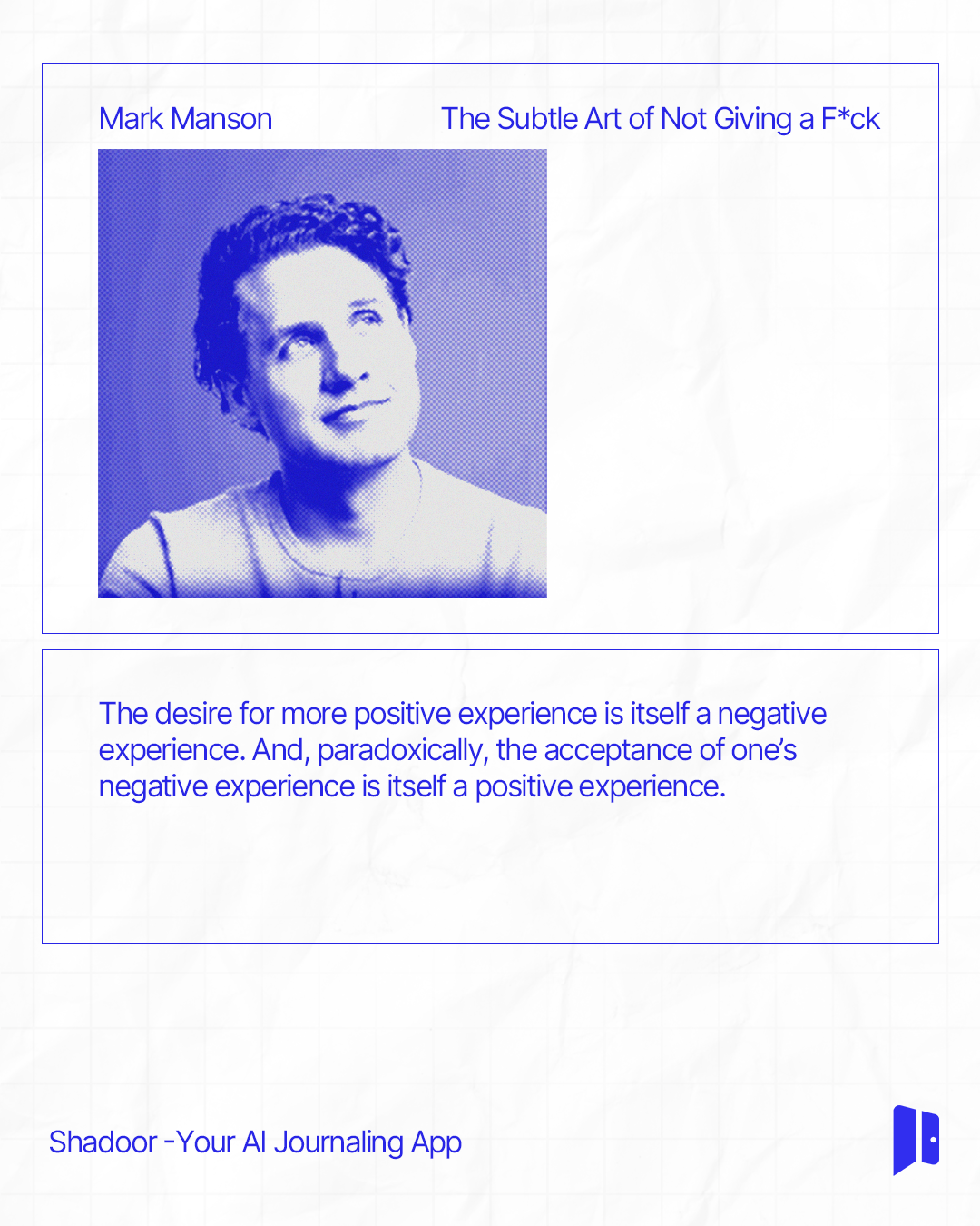
Alongside original brand copy, the content system drew on ideas from writers whose thinking aligned with Shadoor's own — a way of putting the app's philosophy in conversation with voices readers already trusted.
The hardest brief is the quiet one. When the answer isn't to be bolder or louder — but to pull back, slow down, and trust that restraint is the strategy.
Shadoor didn't need a brand that performed wellness. It needed one that actually felt like it. That's the distinction we worked to protect at every decision point.
A companion campaign built around the same voice principles, illustrated rather than photographed — carrying the brand into a bolder, more graphic register without losing the gentleness underneath.